.png)
Home Cook
Creating an end-to-end iOS app for a cooking/recipe app to help home cooks discover more diverse cuisines
Project Date: November 2020
Company: Home Cook
My Role: Research, personas, sitemapping, task/user flows, sketching, wireframing, prototyping, user testing
Team: Product Manager, Group Crit Peers


Overview
Project Background
The idea of Home Cook came to me during quarantine where I found myself cooking a lot at home, and looking for more variety to add to my weekly meals. I wanted to try different cuisines, and cook meals that I enjoyed eating growing up, but had immense trouble finding recipes that stood up to my expectations, often trying (and mostly failing) to read through Chinese blogs to recreate the flavors I knew and craved.
Home Cook was born out of the need for more diversity in the western food publication world. Written by immigrants, Home Cook offers that authentic, home cooking experience that people seek when they are experiencing and learning about other cultures through food.
The Challenge
How might we differentiate Home Cook from other competitors in the market from a user experience point of view?
Objectives
Design an end-to-end iOS app that allows users to bookmark, explore, organize groceries and share recipes with one another.
Empathize
Why
Using various research methods to understand and empathize with the user's needs, frustrations, and goals
How
-
Research Ramp-Up: Secondary Research & Competitive Analyses, Provisional Personas
-
4 Interviews (1 hr per interview)

Research Ramp-Up Findings
-
In order to increase engagement, content must be high quality, tried and trusted. For Home Cook to be a successful social sharing cooking app, there needs to be a way to maintain the quality of content, as well as a way for people to submit reviews
-
Home Cook needs to make it easy for users to actually cook - little features like preventing users from having to scroll back and forth, being able to adjust servings, and built-in timers provide high user value
-
Home Cook needs to make it easy for users to search and filter according to their personal tastes and preferences
-
Home Cook needs to be inspiring - providing visually appealing photos, UI and content that can excite people to cook a recipe for their next meal
Interviews
After understanding competitors in the industry, it was time to dig into the habits of users and empathize with them through 1-on-1 interviews, each one lasting up to 1 hour.
Number of Participants: 4
Ethnicity: Pakistani/Indian, Cantonese, Taiwanese
Age Range: 24-25
Location: Hamptons, NYC, Hong Kong
Interview Findings
Insight 1: How often individuals cook depends on where they live and how easy it is to access the food they want to eat (i.e. an individual who used to live in London would eat out more often versus cooking at home a lot more now in Hong Kong because he lives in the mountains).
Insight 2: The biggest challenge for interviewees across the board is having access to ingredients that are hard to find and/or substitute to make the dish they want to make.
Insight 3: Every interviewee said that the ingredients they have on hand influences what they want to cook, therefore they like to search for recipes by ingredients
Insight 4: When it came to trusting recipes, every participant mentioned taking extra care to do the research to make sure that the recipe was authentic and that the end results closely resembled what they knew a dish to be.
"I will look for the worst quality websites because it's usually Indian aunties that are on these obscure blogs posting their recipes. I can only trust an Indian recipe if it's from an Indian auntie."
– Saher
"If I'm looking for a Chinese recipe, I'll just search up the dish in its Chinese name and read those blogs in Chinese."
– Annie
Insight 5: Every participant mentioned calling their mom for recipes to dishes they want to cook, but said that because the instructions are so narrative and without precise measurements, it's hard to get it exactly right. This causes participants to improvise or do further research.
"When you ask an Indian person for a recipe, you get smidgens of potential paragraphs. You don’t get how much of something to put in, so much of it is passed down by word of mouth and practice, and is developed to your taste. "
– Saher
Define
Why
To leverage all previous research to define high level goals and identify priorities for Home Cook's features.
How
-
User Persona
-
Feature Roadmap
User Persona
My interview debrief revealed two distinct types of home cooks - the experienced home cook (Celine) and the not-that-serious home cook (Jennifer).


Feature Roadmap
With my two personas in mind, my next step was to create a feature roadmap for Home Cook, making sure that I am designing for both types of users and prioritizing features from must-haves, nice-to-haves, surprising & delightful, and those that can come later. This table helped me manage my time wisely and deliver an MVP.

Ideate
Why
With my personas and must have features defined, it was time to ideate and visualize how Home Cook can come to life from a logical standpoint.
How
-
Sitemap
-
Task Flow
-
Wireframe Sketches
Sitemap
Using Whimsical, I created a sitemap for Home Cook. Starting with the navigation menu and working my way down, referring to my "must-haves" on my feature roadmap to ensure all the features are there.

Task Flows
Using the same tool, I created two task flows for the main functions the app should have.
The first one being that users can find, save and start cooking from a recipe.
The second task being that users can create and share a recipe.
.png)
Sketching Wireframes
Using the Procreate app on my iPad, I began sketching out my wireframes. I referred to my sitemap and task flows to guide me on which screens to sketch out, highlighting in orange to indicate which nav bar menu page a screen belongs to.

Digitizing Wireframes
Using Figma, I transferred my sketches into mid-fidelity wireframes. At this stage, I was using a grid layout, thinking about typography, choosing an icon set (Material Icons), and overall UI design.


Design
Why
Because browsing recipes is such a visual experience, I decided to work on the UI design of Home Cook prior to prototyping and conducting user tests. In this stage, I developed Home Cook's visual identity
How
-
UI Kit
-
Applying UI design to wireframes
UI Kit
When designing the mid-fidelity wireframes, I had already created components, picked out a type pairing (Source Serif Pro & Karla), icon set, and had a good idea of the colors I wanted to use. Knowing that warm colors inspire hunger/appetite, I picked a bright red-orange color as the brand's primary color, an egg-yolk yellow as a secondary color, and a pale/grey blue as a neutral highlight. By creating a UI Kit, I could further establish branding guidelines for Home Cook.

Applying UI to Wireframes
Using my UI Kit, I applied color, branding, and photos to my mid-fidelity prototype to bring Home Cook to life. In addition to the mobile screens, I created one screen optimized for iPad to show how it scales. Since many home cooks prefer to use the iPad while cooking, it was important for me to show what that might look like.


Prototype
Why
With the high fidelity wireframes ready to go, the next step was to test my assumptions for the task flows. I worked directly in the Figma file to create a click-through prototype with basic interactions/animations.
How
-
High-fidelity click-through prototype

Test
Why
With my prototype up and running, it was time to validate and test my product and make any necessary revisions.
How
-
Usability Testing
-
Affinity Map
-
Priority Revisions Matrix
Usability Testing
-
Total User Testing Participants: 6
-
Duration: 9 hrs
-
Goal: To test my assumptions of how users would navigate the app and if users would find the features useful
-
# of Tasks: 4
There were 4 tasks each user had to complete. After a user completes 1 task, I would follow up with questions specific to that task to gain a deeper understanding of their actions, expectations, frustrations and general impressions. I transcribed every user testing session and had 23 pages of material to work with.
See the four tasks/scenarios outlined below:
-
You are planning dinner and you aren’t sure what you want to cook, but you do know that you are interested in noodles. Can you walk me through how you would navigate the app?
-
You find the recipe that you want to try - Taiwanese Beef Noodles, you’re going to bookmark it and save the ingredients so you can go shopping for the things you need. How would you navigate shopping for ingredients?
-
It's time for dinner, can you show me how you would navigate the app to start cooking the recipe you bookmarked?
-
Let's switch to a different scenario. You've just called your mom up for a recipe for a simple stir fried cabbage dish - something you ate growing up. You want to save that recipe in the app. Can you walk me through how you would do that?

"The fact that this app doesn't exist right now is silly."
– Saher
"I feel like I need this app in my life now. It's hard to believe this isn't a real app I could just download from the app store."
– Aurelia
Affinity Map
To synthesize my findings from my usability testing sessions, I created an Affinity Map to track Successes, Concerns, and Observations / Suggestions, and color coding the notes by which task they refer to.
.png)
Affinity Map Findings
Overall, the user testing sessions were a success. Every user was able to complete the tasks easily and any suggestions or concerns were mainly on how to make things more clear, improve on something, or hypothetical cases that were out of scope.
A few major concerns were:
-
Because I had not designed the screens of other user profiles and the ability to follow them, it was not obvious to users that the home page is a recipe feed posted by other users they follow.
-
Even though swiping right to reveal CTAs is a common design pattern for list items, users would never have known that the interaction exists in the grocery list screen for individual ingredients. If one swipes left on an ingredient, a CTA would be revealed where users can click "Find" or "Delete." This is something that I explained would be hinted through a short animations when a user arrives to the page for the first time, but was out of Figma's prototyping capabilities.
I was able to test my assumptions for this app to cater to both the Jennifer persona (less experienced cook) and the Celine persona (experienced cook). I found that though Celine wouldn't use all the detailed features (like step-by-step screens), Jennifer will.
In conclusion, many of the changes that will be made are small but impactful ones. That being said, the prototype itself received glowing reviews from every participant across the board - they all said they wish this app existed because of the unique concept, the surprising features, and its user-friendly and visually-appealing interface.
Priority Revisions Matrix
The next step was selecting which concerns and suggestions to act on. By organizing the stickies that fell under the "Concerns" and "Suggestions" sections in my Affinity Map in a priority revisions matrix that measured user value against (my) effort to implement, I was able to quickly prioritize which problems to immediately address (high value, low effort), which problems I can tackle next (high value, high effort), and which ones not to focus on at all if they were one-off problems/suggestions with low user value.
.png)
Iterate
Why
Based on user testing feedback, improve the usability of my product.
Revisions
See below for major changes I made to my wireframes.


What's Different
To make the homepage "Feed" more obvious that it's a feed, I created an Instagram stories-like pattern that will show users what the people they follow recently cooked. This also introduces more diversity and variety into a homepage that could quickly become monotonous.
What's Different
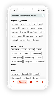
I created an empty state for the search bar to show users all the kinds of things they can search by, such as by ingredients. This was a question that consistently came up during user testing but the only search item I had designed for was if a user had searched a dish - "noodles"
What's Different
Added a follow button to further establish Home Cook as a social sharing community of home cooks, making it easy for users to follow a fellow home cook within a recipe page.
What's Different
Users wondered how the grocery list would look if they had multiple recipes in their list. My solution was to create an accordion-style drop-down of individual recipes. I also created a "Repeat Ingredients" list at the top to consolidate any overlapping ingredients.


What's Different
Instead of having the checked off ingredient move to the bottom of the list, I decided to keep the item in place to reduce confusion in users. This is crucial especially when the list of ingredients gets long and users aren't able to immediately see where the checked off ingredient went. I also added a servings adjuster.
What's Different
It was confusing to have both reviews and comments consolidated in one place so I used the same tab pattern to create separate tabs for reviews and comments. The text input at the bottom of the screen would change based on which tab you were in.
What's Different
Many users mentioned that they wouldn't necessarily have a photo on hand when they're inputting a recipe especially if they haven't cooked it yet. An easy fix for that was to put the option of adding a photo at the bottom of the form.
What's Different
To further make Home Cooks more of a social sharing community, I designed the previously absent user profile (I had only designed the user's own profile). In this screen, users can only see recipes that other users have published and have the ability to follow them. I also replaced the settings icon at the top right corner with a messaging button to encourage users to interact with one another.
Final Prototype
Last but not least, please enjoy my final prototype!
Keep in mind the 4 tasks as follows as you go through my prototype:
-
Search for Taiwanese Beef Noodle Soup by using the search bar and applying filters
-
Save ingredients to the grocery list
-
Find the Beef Noodle Soup in your Cookbook (Bookmarks) and Start Cooking. Then, leave a review.
-
Create a recipe
Next Steps
Conclusion
In conclusion, my prototype was a great success and I could not be happier about the end result. Every person that I user tested the product with mentioned that this was something they never asked for, but now felt like they needed just because it answered all their pains and frustrations when it came to looking for a reliable recipe platform that was easy to use and offered a diverse range of cuisines they had never seen before in the western food publication world.
Future Considerations
Because this project was completed in a 2-week sprint, there are a few things I would do differently if I had the time and resources:
-
Interviewing a larger, more diverse group of home cooks
-
Take more time to work on Home Cook's branding and logo design
-
Conduct user testing with more people
-
Conduct user testing after making revisions to continue iterating and improving the product
This project is a personal project and Home Cook is a fictional brand.